
The original goal of Blaine Bettinger’s Shared cM Project was to document the actual shared ranges of centiMorgans found in various relationships between testers in genetic genealogy. Previously, all we had were academically calculated models which didn’t accurately really reflect the data that genetic genealogists were seeing.
In June 2016, Blaine published the first version of the Shared cM Project information gathered collaboratively through crowd-sourcing. He continued to gather data, and has published a new 2017 version recently, along with an accompanying pdf download that explains the details. Today, more than 25,000 known relationships have been submitted by testers, along with their amount of shared DNA.
Blaine continues to accept submissions at this link, so please participate by submitting your data.
In the 2017 version, some of the numbers, especially the maximums in the more distant relationship categories changed rather dramatically. Some maximums actually doubled, meaning having more data to work with was a really good thing.
The 2017 project update refines the numbers with more accuracy, but also adds more uncertainly for people looking for nice, neat, tight relationship ranges. This project and resulting informational chart is a great tool, but you can’t now and never will be able to identify relationships with complete certainly without additional genealogical information to go along with the DNA results.
That’s the reason there is a column titled “Degree of Relationship.” Various different relationships between people can be expected to share about the same amount of DNA, so determining that relationship has to be done through a combination of DNA and other information.
When the 2016 version was released, I completed a chart that showed the expected percentage of shared DNA in various relationship categories and contrasted the expected cM of DNA against what Blaine had provided. I published the chart as part of an article titled, Concepts – Relationship Predictions. This article is still a great resource and very valid, but the chart is now out of date with the new 2017 information.
What a great reason to create a new chart to update the old one.
Thanks to Blaine and all the genetic genealogists who contributed to this important crowd-sourced citizen science project!
2016 Compared to 2017
The first thing I wanted to know was how the numbers changed from the 2016 version of the project to 2017. I combined the two years’ worth of data into one file and color coded the results. Please note that you can click on any image to enlarge.

The legend is as follows:
- White rows = 2016 data
- Peach rows = 2017 data for the same categories as 2016
- Blue rows = new categories in 2017
- Red cells = information that changed surprisingly, discussed below
- Yellow cells = the most changed category since 2016
I was very pleased to see that Blaine was able to add data for several new relationship categories this year – meaning that there wasn’t enough information available in 2016. Those are easy to spot in the chart above, as they are blue.
Unexpected Minimum and Maximum Changes
As I looked at these results, I realized that some of the minimums increased. At first glance, this doesn’t make sense, because a minimum can get lower as the range expands, but a minimum can’t increase with the same data being used.
Had Blaine eliminated some of the data?
I thought I understood that the 2017 project simply added to the 2016 data, but if the same minimum data was included in both 2016 and 2017, why was the minimum larger in 2017? This occurred in 6 different categories.
By the same token, and applying the same logic, there are 5 categories where the maximum got smaller. That, logically, can’t happen either using the same data. The maximum could increase, but not decrease.
I know that Blaine worked with a statistician in 2016 and used a statistical algorithm to attempt to eliminate the outliers in order to, hopefully, eliminate errors in data entry, misunderstandings about the proper terms for relationships and relationships that were misunderstood either through genealogy or perhaps an unknown genetic link. Of course, issues like endogamy will affect these calculations too.
A couple good examples would be half siblings who thought they were full siblings, or half first cousins instead of just first cousins. The terminology “once removed” confuses people too.
You can read about the proper terminology for relationships between people in the article, Quick Tip – Calculating Cousin Relationships Easily.
In other words, Blaine had to take all of these qualifiers that relate to data quality into consideration.
Blaine’s Explanation
I asked Blaine about the unusual changes. He has given me permission to quote his response, below:
The maximum and minimum aren’t the largest and smallest numbers people have submitted, they’re the submissions statistically identified by the entire dataset as being either the 95th percentile maximum and minimum, or the 99th percentile maximum and minimum. As a result, the max or min can move in either direction. Think of it in terms of the histograms; if the peak of the histogram moves to the right or left due to a lot more data, then the shoulders (5 & 95% or the 1 and 99%) of the histogram will move as well, either to the right or left.
So, for example, substantially more data for 1C2R revealed that the previously minimum was too low, and has corrected it. There are still 1C2R submissions down there below the minimum of 43, and there are submissions above the maximum of 531, but the entire dataset for 1C2R has statistically identified those submissions as being outliers
The histogram for 1C2R supports that as well, showing that there are submissions above 531, but they are clearly outliers:

People submit “bad” numbers for relationships, either due to data entry errors, incorrect genealogies, unknown pedigree collapse, or other reasons. Unless I did this statistical analysis, the project would be useless because every relationship would have an exorbitant range. The 95th and 99th percentiles help keep the ranges in check by identifying the reasonable upper and lower boundaries.
Adding Additional Information
The reason I created this chart was not initially to share, but because I use the information all the time and wanted it in one easily accessible location.
I appreciate the work that Blaine has done to eliminate outliers, but in some cases, those outliers, although in the statistical 1%, will be accurate. In other cases, they clearly won’t, or they will be accurate but not relevant due to endogamy and pedigree collapse. How do you know? You don’t.
In the pdf that Blaine provides, he does us the additional service by breaking the results down by testing vendors: 23andMe, Ancestry and Family Tree DNA, and comparison service, GedMatch. He also provides endogamous and non-endogamous results, when known.
The vendor where an individual tests does have an impact on both the testing, the matching and the reporting. For example, Family Tree DNA includes all matches to the 1cM level in total cM, Ancestry strips out DNA they think is “too matchy” with their Timber algorithm, so their total cM will be much smaller than Family Tree DNA, and 23andMe is the only one of the vendors to report fully identical regions by adding that number into the total shared cM a second time. This isn’t a matter of right or wrong, but a matter of different approaches.
Blaine’s vendor specific charts go a long way in accounting for those differences in the Parent/Child and Sibling charts shown below.

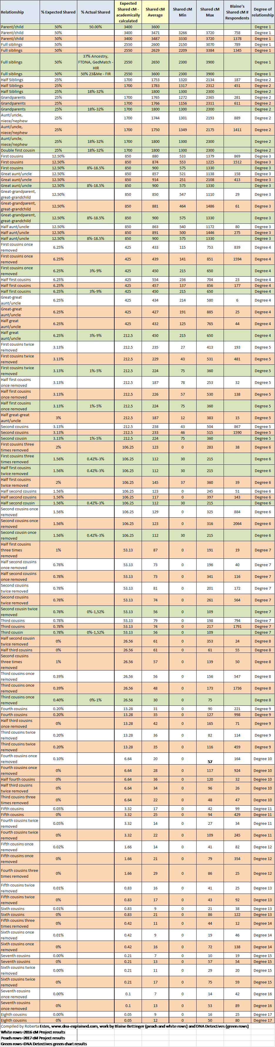
A Combined Chart
In order to give myself the best change of actually correctly locating not just the best fit for a relationship as predicted by total matching cM, but all possible fits, I decided to add a third data source into the chart.
The DNA Detectives Facebook Group that specializes in adoption searches has compiled their own chart based on their experiences in reconstructing families through testing. This chart is often referred to simply as “the green chart” and therefore, I have added that information as well, rows colored green (of course), and combined it into the chart.
I modified the headings for this combined chart, slightly, and added a column for actual shared percent since the DNA Detectives chart provides that information.
I have also changed the coloring on the blue rows, which were new in 2017, to be the same as the rest of Blaine’s 2017 peach colored rows.
I hope you find this combined chart as useful as I do. Feel free to share, but please include the link to this article and credit appropriately, for my work compiling the chart as well as Blaine’s work on the 2016 and 2017 cM Projects and DNA Detective’s work producing their “green chart.”
______________________________________________________________
Disclosure
I receive a small contribution when you click on some of the links to vendors in my articles. This does NOT increase the price you pay but helps me to keep the lights on and this informational blog free for everyone. Please click on the links in the articles or to the vendors below if you are purchasing products or DNA testing.
Thank you so much.
DNA Purchases and Free Transfers
- Family Tree DNA
- MyHeritage DNA only
- MyHeritage DNA plus Health
- MyHeritage FREE DNA file upload
- AncestryDNA
- 23andMe Ancestry
- 23andMe Ancestry Plus Health
- LivingDNA
Genealogy Services
Genealogy Research
- Legacy Tree Genealogists for genealogy research
