
This is Part 8 of a multi-part series, “The Autosomal Me.”
Part 1 was “The Autosomal Me – Unraveling Minority Admixture” and Part 2 was “The Autosomal Me – The Ancestors Speak.” Part 1 discussed the technique we are going to use to unravel minority ancestry, and why it works. Part two gave an example of the power of fragmented chromosomal mapping and the beauty of the results.
Part 3, “The Autosomal Me – Who Am I?,” reviewed using our pedigree charts to gauge expected results and how autosomal results are put into population buckets. Part 4, “The Autosomal Me – Testing Company Results,” shows what to expect from all of the major testing companies, past and present, along with Dr. Doug McDonald’s analysis. In Part 5, “The Autosomal Me – Rooting Around in the Weeds Using Third Party Tools,” we looked at 5 different third party tools and what they can tell us about our minority admixture that is not reported by the major testing companies because the segments are too small and fragmented.
In Part 6, “The Autosomal Me – DNA Analysis – Splitting Up” we began the analysis part of the data we’ve been gathering. We looked at how to determine whether minority admixture on specific chromosomes came from which parent.
Part 7, “The Autosomal Me – Start, Stop, Go – Identifying Native Chromosomal Segments”, took a deeper dive and focused on the two chromosomes with proven Native heritage and began by comparing those chromosome segments using the 4 GedMatch admixture tools.
In this segment, Part 8, we’ll be extracting all of the Native and Blended Asian segments on all 22 chromosomes, but I’ll only be using chromosomes 1 and 2 for illustration purposes. We will then be clustering the resulting data to look for trends. If you’re following along and using this methodology, you’ll be extracting the Native segment start and stop locations from all 22 chromosomes.
I apologize in advance for the length of this article, but there was just no good place to break it into pieces.
So, let’s get started. As a reminder, we are using the admixture tools at www.gedmatch.com.
I experimented with several types of extractions to see which ones best reflected the results found by both 23andMe and Dr. McDonald and confirmed by the start and stop segments in the highly Native segments of chromosomes 1 and 2 in Part 7 of this series. We verified that all 4 tools accurately reflected and corroborated the segments listed as Native, so now we’re going to apply that same methodology to the rest of our chromosomal data.
Initially, I tried to use the information from chromosomes 1 and 2 to extract the Native chromosomes using only the “best” tool, but when I looked at all 4 tools, I quickly realized that there was no single “best” choice. A couple of crucial points came to light.
- Some of the geographic colors are almost impossible to tell apart.
- None of the tools are universally best.
- When looking at all 4 tools, generally a “best 3 out of 4” approach allowed for one of the tools to be wrong, to perhaps reference a slightly different data base that called the segment differently or for the colors to be indistinguishable. In other words, if three called a segment Native and one did not, it’s Native and conversely, if less than 3 call it Native, in this comparison, it’s not.
Unfortunately, this created an awful lot of work. This is probably the best example of where automation tools could and would make a huge difference in this process.
I did two separate extracts. The first one is what I refer to as the “Strong Native” extract and the second is the “Blended Asian.” In part, I did these separately as a check and balance to be sure that my first extraction was accurate.
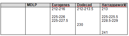
In the first extract, I selected only one category, the one best fitted to “Native American” for each tool. I used the following categories for each admixture tool:
- MDLP – Amerind
- Eurogenes – North Amerindian
- Dodecad – NE Asian
- Harrappaworld – American
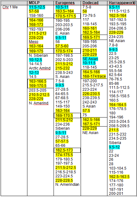
I completed this process for every chromosome, but I’m only showing the first two chromosomes in this article.
By way of example, using the first tool, MDLP, North Amerind looks black, but is actually very dark grey. It is, fortunately, distinctive.
On the chromosome painting below, my results for the first part of chromosome 1 are shown in the first band, and mother’s for the same segment are shown as the second band. The bottom band represents common segments and the black is non-matching segments, meaning those I obtained from my father. Sometimes this third band can help you determine what you are really seeing in terms of colors and blending, but it’s not always useful. In this case, trying to spot a small amount of dark gray against black is almost impossible, so not terribly helpful. But if you were looking for red, that would be another story. As you move through this process, remember, it’s not exact and utilizing best 3 of 4 will help you recover from any major errors.
You can see that my grey segments show up from about 12-13 and then again at about 14.5. Sometimes it’s difficult to know how to count something. For example, my Native at 14.5 – it’s actually more like 14.25 -14.5, but I chose not to divide further than half mb segments. As long as you are consistent in whatever methodology you select, it will work out.
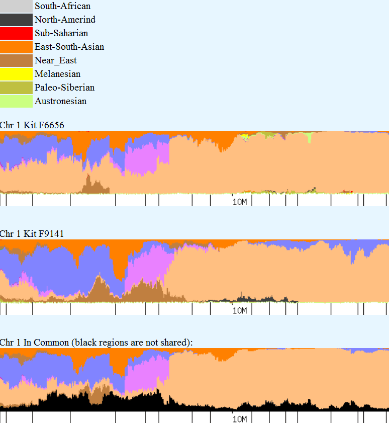
Please note that when reading these charts, that the small hash mark is the indicator for the measure. In other words, the small hash mark above 10M means that is the 10M location. It’s obvious here, but on some charts, the hash mark and the location legend look to be 1-off. Again, as long as you’re consistent, it really doesn’t matter.
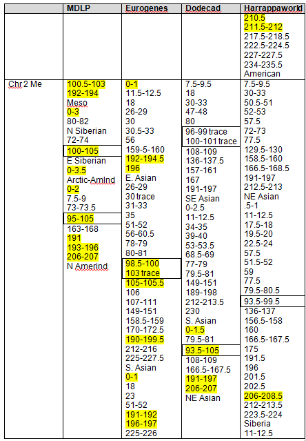
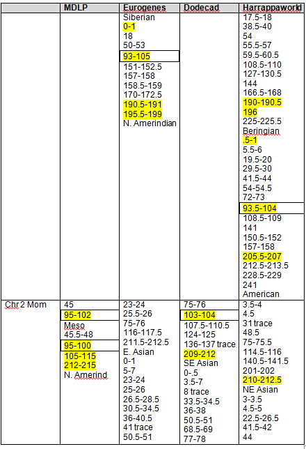
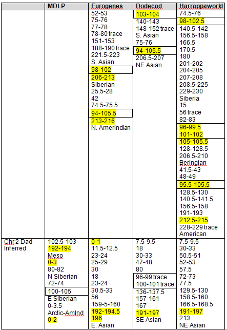
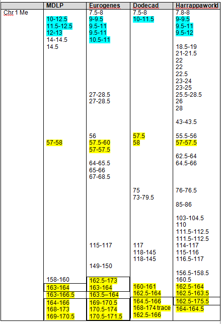
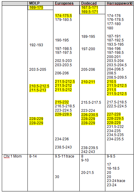
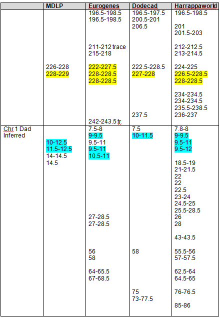
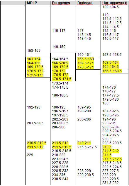
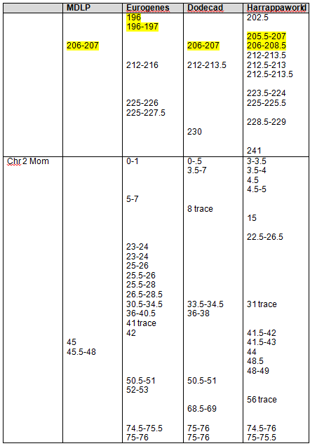
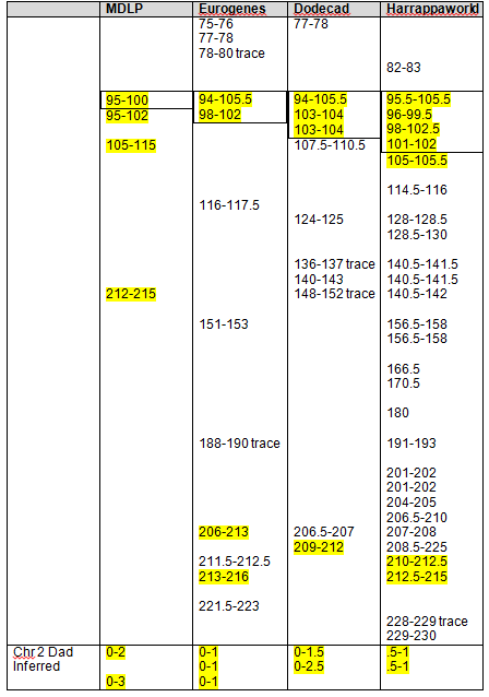
Mother’s Native segments are more pronounced and obvious. They range from about 8-14. Using the actual tools, you would record this and then continue scrolling to the right until you reach the end of the chromosome. On chromosomes 1 and 2, I found the strong Native segments for the four admixture tools, as shown below.
The boxed numbers show the areas that were found “in common” between 23andMe, Dr. McDonald and the admixture tools, as determined in Part 7 of this series. Highlighted segments show segments where at least 3 of 4 admixture tools reported Native heritage. As you can see, there were clearly additional Native segments not reported by 23andme and Dr. McDonald.
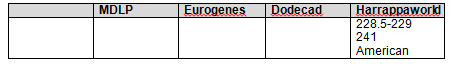
Strong Native Chromosomal Detail Table
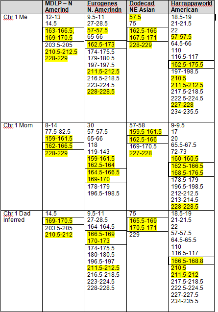
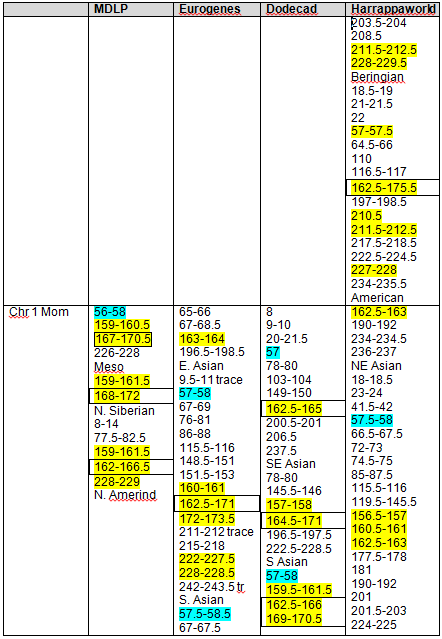
Because we have both my and mother’s results, we can infer my father’s contribution. Clearly, some of his will wind up being some amount of “noise” and some IBS segments, but not all, by any means, and this is the only way to get a “read” on Dad. This is one form of phasing data. Phasing refers to various methodologies of figuring out which DNA comes from what source, meaning which parental line.
While the strongest Native segments are the ones individually most likely to indicate Native American ancestry, that really isn’t the whole story. I discovered that many of these Native segments are actually embedded in other segments that are indicative of Native heritage too. In other words, it’s not a line in the sand, yes or no, but more of a sliding scale.
On the chromosome painting below, this one using Eurogenes, with my results shown above and mother’s below, you can see two excellent examples. Regions relevant to Native ancestry include:
- Red – South Asian
- Brown – Southwest Asian
- Yellow – North Amerindian and Arctic
- Putty – Siberian
- Emerald – East Asian
You can see that while mine is almost universally yellow, or Native, with a little Siberian (putty) mixed in for good measure between 169-170, a hint of East Asian (emerald) plus a little Asian (red), mother’s isn’t. In fact, hers is a mixture of Native American and South Asian (red), with more red than yellow, Siberian (putty) and a large segment of East Asian (emerald green).
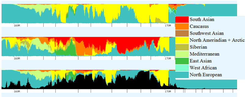
While her yellow Native segments alone would be staggered across this entire segment in 7 different pieces, when taken together as a whole, the “blended Asian” segment reaches entirely across the screen with the exception of 1 mb between 161.5-162.5, roughly.
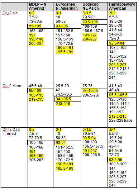
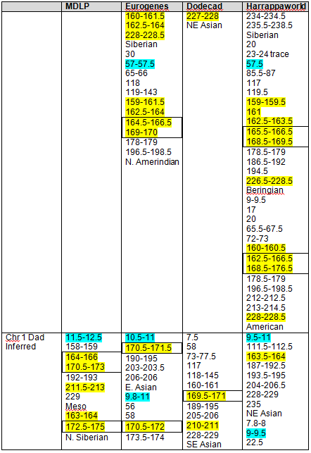
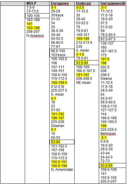
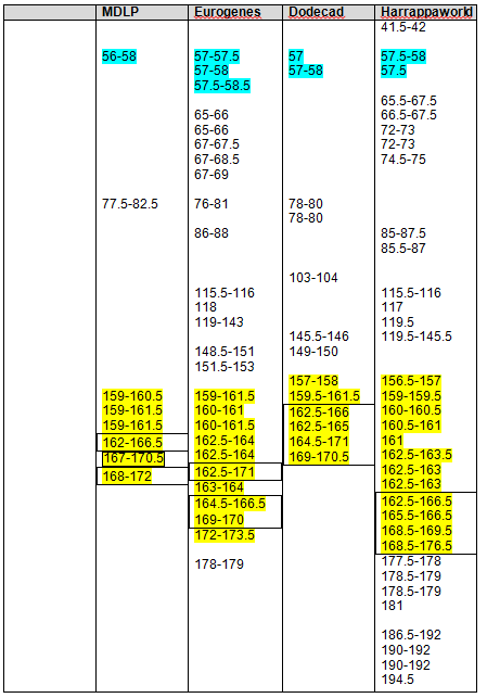
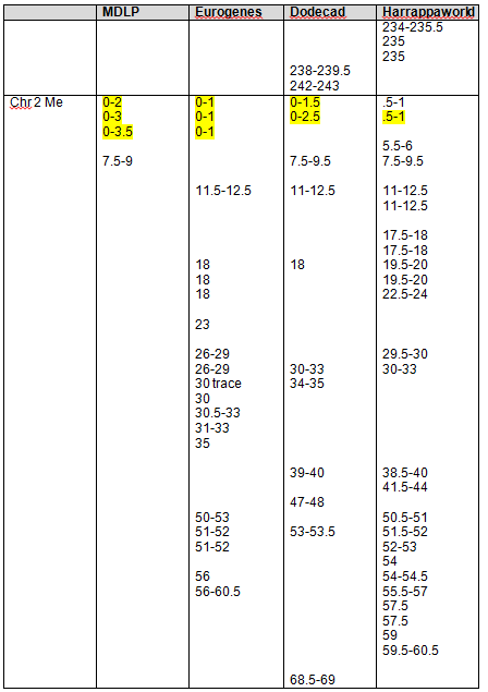
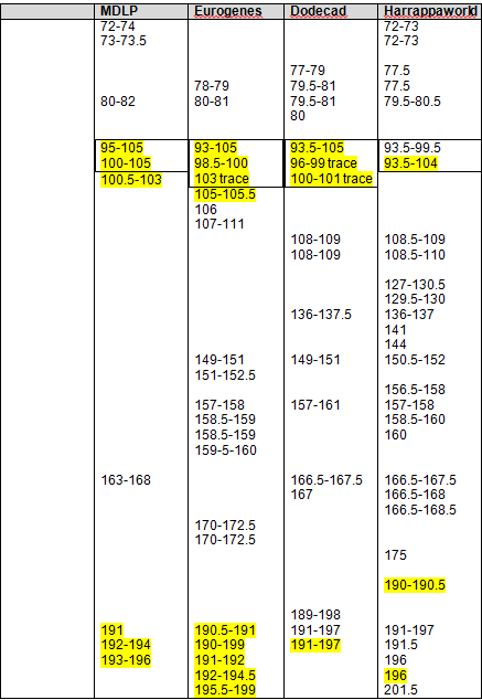
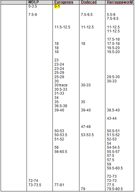
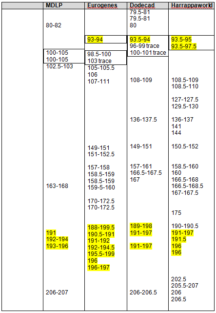
The following Blended Asian Chromosomal Detail Table shows all of the blended Asian segments using all four of the admixture tools for chromosomes 1 and 2.
It’s clear that these regions are not solely “Native American” but reach back in time genetically into Asia, particularly Northeast Asia.
Again, the boxed numbers show the “in common” segments between all tools and the yellow highlighted segments are common between at least three of the four admixture tools.
Please note that there were some issues distinguishing colors, as follows:
- For the MDLP comparison, Mesoamerican and Paleo Siberian are both putty colored and indistinguishable on the chart. Also, the apple green for Arctic Amerind is very similar to the Austronesian.
- When using Dodecad, Southeast Asian (light green) and South Asian (apple green) are nearly impossible to distinguish from each other on the graphs.
- When using HarappaWorld, the apple green for Siberian was very similar to the light forest green for Papua New Guinea and was very difficult to distinguish. The South Asian putty appears often with the other Native markers, and I considered including this group, but it too was difficult to distinguish from other regions so in the end, I opted not to include this category.
- If you are colorblind – get help as this is impossible otherwise.
Blended Asian Chromosomal Detail Table
On the blended Asian Chromosome Detail Table, I added yellow highlighting where the same segments show in other Asian geographies that showed in the Strong Native table. In each column, the Strong Native category is the last one at the bottom of the list.
The blue highlighting shows other common segments found that were not included in the Strong Native segments. For a Strong Native yellow segment to be highlighted, it had to be present in 3 of 4 tools, or 75%. In the Blended Asian group, there are a total of 15 categories between the 4 admixture tools, so for a segment to be shaded blue, it must be found in at least 8 of the categories, so just over half. There are many segments that are found in several categories across the tools. For example, segment 192-193 on chromosome 1 is found five times. This isn’t to say you should discount this segment, only that it isn’t one of the strongest, most universal. Surprisingly, there really weren’t too many that were close to the cutoff. Several, but not a majority, were in the 4 or 5 range, only one was at 7.
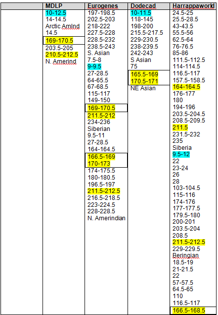
Clustering
The third step in data extraction is to look at all of the data together. In this step, we are removing the geographic boundaries of Siberian, N. Amerindian, etc. and combining all of our data. I have only combined the data within columns, not between columns, so we can get a feel for which tool or tools performed best or maybe not so well. Each chromosome in each column has its data ordered numerically, and yes, this is a manual cut and paste process. Sorry. I warned you, this is an very manually intensive process.
After I put each column in numerical order, I arranged them so that the numbers were approximately in a line, or a row, with each other. For example, in the first group below, you can clearly see that the first cluster of results is found using all 4 tools. When looked at individually, only the blue results were noted as common (at least 8 of 15 for blue), but when viewed as a cluster, you can see between the tools that the cluster itself runs from about 7.5, with a small break from 8-9, and then to about 14.5. As you would expect the beginning and end points of the cluster trail off and are not uniform between tools, but the main part of the cluster is found in all the tools. This introduces the question of how to measure a cluster. In this case, there is a clean break using all tools between 8 and 9, but that is only 1 mb, rather difficult to measure accurately. You could record this as two distinct clusters but since it’s very closely adjacent the rest of the cluster, I’m inclined to include this as one large cluster and use the starting and ending segments for the cluster as a whole, in other words, the cluster runs from 7.5 through 14.5. The alternate, or more conservative methodology would be to use the “in common” numbers, but in this case, that would be only 10-11.5 and I think you would miss a great deal of useful data. So, for clusters, I’m recording the full extent of the cluster. In some cases, you may need to exercise a judgment call.
Let’s look at the second group of numbers, beginning with 18.5 in Harrappaworld. This grouping runs though about 28. Eurogenes found some blended Asian between 27-28.5 as well in two of the geographies, but over all, of the 15 tools, we don’t see much. This could be a result of a number of things. I could have had problems with the colors, there may be only a very small amount and it may be categorized as something else with the other tools. I would not consider this a cluster, and using our best 3 or 4 methodology eliminates this cluster from consideration. This also holds true for 43-43.5.
However, the next cluster, from 55.5 to 58 is found in the Strong Native comparison, indicated by the yellow highlighting and is found using all 4 tools. This is definitely a cluster.
I’ve synthesized the cluster information into a list. From the clusters above, I’ve created a list that I will be using in the next segment for data input into my spreadsheet of matches. The blended segments below that include Strong Native segments are shown with yellow.

Using the GedMatch admixture applications, we’ve isolated the strongest Native and the Blended Asian segments and clusters in preparation for identifying specific Native family lines within our group of matches.
This process shows that, for the most part, the Strong Native segments picked up the strongest signals, about half of the segments that will be useful in determining Native admixture, although it does miss some.
When we use the clustering technique to view our results across all the admixture tools, we see a somewhat different picture emerge, adding several Blended Asian clusters.
In Part 9 of this series, we will use the highlighted Strong Native segments and the Blended Asian clusters, both of which suggest Native chromosomal “hotspots” to begin our comparison to our genetic matches for genealogical relevance. In other words, using this information, we will determine which genealogical lines carry Native ancestry.
Part 9 may be somewhat delayed. The good news is that Family Tree DNA is finishing work on their Build 36 to Build 37 conversion. The bad news is that it fell right in the middle of writing this series. When they finish Build 37, I’ll finish Part 9 of this series. In the mean time, you can be extracting your minority segments using the tools and techniques that we have covered in Parts 1-8.
______________________________________________________________
Disclosure
I receive a small contribution when you click on some of the links to vendors in my articles. This does NOT increase the price you pay but helps me to keep the lights on and this informational blog free for everyone. Please click on the links in the articles or to the vendors below if you are purchasing products or DNA testing.
Thank you so much.
DNA Purchases and Free Transfers
- Family Tree DNA
- MyHeritage DNA only
- MyHeritage DNA plus Health
- MyHeritage FREE DNA file upload
- AncestryDNA
- 23andMe Ancestry
- 23andMe Ancestry Plus Health
- LivingDNA
Genealogy Services
Genealogy Research
- Legacy Tree Genealogists for genealogy research

Pingback: Part 8 of the Series, The Autosomal Me, Published | Native Heritage Project
Roberta, you have written another glorious, thought-provoking article, teaching us how to get from here to there. Great!
Easy to follow. Thank you.
Does anyone know if the Indian that is marked by the light blue represent? Is it India?
I believe so. It depends on which tool you’re referring to. I e-mailed the developers on one of them and you may need to do the same to verify.
Thank you, Mrs. Estes. I will do that. It shows up on my maternal uncles and my chromosomes often and I just did not want to guess. Thank you again for the post to day it made using the tools so easy. You rock!!!
You are most welcome and thank you for taking a minute to say thank you:)
I don’t consider myself Black or Indian. What do I need to do to figure out some of the raw data from my autosomal dna test from Ancestry.com? I have read many articles and most of them state the need for a chromosome browser is needed. What do I get one and how much will it cost? Arlene Miles mom4cats@sbcglobal.net
There are two Ancestry issues here. Issue 1 – Ancestry only recently released people’s raw data files. Downloading instructions were in this blog posting: http://dna-explained.com/2013/03/21/downloading-ancestrys-autosomal-dna-raw-data-file/ However, it was reported a few days ago that that option was no longer available, so I don’t know if Ancestry experienced some difficulty, and if so, if it has been resolved. GedMatch has not been able to accommodate Ancestry files for comparison, but they are working on doing so. Issue 2 – Ancestry does not have a Chromosome Browser for their clients to use. This means that you do match the people they show you, but it may or may not be to whom they suggest in their tree matches. Without a chromosome browser, there is no ability to tell. You can’t buy this separately, the vendor has to provide it. You can test at the other two companies who do provide these types of tools for their clients – http://www.Familytreedna.com (Family Finder test) or http://www.23andme.com. Many people test at 23andMe then upload their file to Family Tree DNA so they can fish in both ponds for less total outlay.
Pingback: DIY DNA Analysis, GenomeWeb and Citizen Scientist 2.0 | DNAeXplained – Genetic Genealogy
I tested with Ancestry.com. Can you tell me which method is best to sort the raw data? I am not a scientist but a curious genealogist.
Wait until GedMatch can accept Ancestry files and then upload your file there. They have tools to use.
Pingback: The Autosomal Me – The Holy Grail – Identifying Native Genealogy Lines | DNAeXplained – Genetic Genealogy
Pingback: The Autosomal Me – Summary and PDF File | DNAeXplained – Genetic Genealogy
“For the MDLP comparison, Mesoamerican and Paleo Siberian are both putty colored and indistinguishable on the chart. Also, the apple green for Arctic Amerind is very similar to the Austronesian.”
You and your mother have so much North-East-European that its color can be used to see the difference between Mesoamerican and Paleo Siberian.
If the putty green is above North-East-European color, then it’s Mesoamerican. If it’s below, then it’s Paleo Siberian. And of course this applies also to lime green of Arctic-Amerind/Austronesian.
Hi Roberta,
I really like your methods of figuring out your ancestry. I agree with other readers that you explain so well. That is why I was wondering if you could provide input or suggestion in my genetic results. I did a genetic testing with 23andme and wanted to explore a part of my ancestry that I may or may not have. As far as I know, I’m Asian (Chinese), but I’ve been asked by a handful of people in the past if I were part White. According to 23andme, when I view my ancestry composition under speculative view (50% confidence level), it shows that I am <.1% Nonspecific European. In standard and conservative views, it does not even list European. That is such a tiny percentage. Does that even mean anything?
I would love to hear your suggestion on how to interpret or approach this.
Thank you,
Hung Lee
It’s very difficult to know. As you may or may not know, the Europeans and Asians share some heritage out of the Altai. It could be residual from this, or it could be someplace back in time you actually have a European ancestor. I would see what the GedMatch admixture tools have to say.
Thanks for your reply. I will try Gedmatch admixture tool and see what it says.
Pingback: DNAeXplain Archives – Intermediate DNA Articles | DNAeXplained – Genetic Genealogy
Hi Roberta, you may have explained this already but I was playing around with the calculators (I never paid much attention to chromosome painting before this) and I found the same large Amerindian segment on several of my chromosome 16 paintings (same place on each), would that be considered a strong native segment? Thank you for all you do! I read your blog all the time and I’ve learned so many things from you. DNA is such an exciting subject. Anyways, thank you again!
Yes, if it appears in the same place in all of them, I would consider that a strong indication.
Thank you for your reply! 🙂
Roberta, I was wanting to ask you one more question. I took the 23&Me Autosomal test and when I got my results, the speculative view shows “Broadly East Asian” but when I go up each confidence level it is put into the “East Asian and Native American” category with the East Asian section going down in percentage. I see on the chromosome painting that it is a “blended Asian segment”, could that possibly be why it is doing that?
Yes, possibly, although without knowing the underpinnings of the 23andMe routines, it’s hard to say for sure.
Thank you so much for your answer! I had to get onto Gedmatch to look at the couple of chromosomes that they looked at. I rarely get any East Asian on the oracle, it always goes into Siberian or Amerindian. That’s why I found it a little odd when it said “Broadly East Asian”.
At least they tell you which chromosome.